Showing posts with label composition. Show all posts

Saturday, April 25, 2015

Anatomy of a Subject


So much of what we do is defined by the elements that embody the concept. The three elements of the exposure triangle help us understand "proper" exposure. Every light source has three distinct qualities (color, quality, direction). Even the physical tools at our disposal can be broken down to a simple trifecta- light, lens, and camera. Being able to break something down into its components helps the beginner by giving them a road map- a series of steps that simplifies the process and makes it easier to understand. With enough repetition, that same road map becomes a mental checklist for the more advanced photographer. Over time, that checklist hopefully just becomes second nature. That photographer might not actually be thinking "foreground, subject, background" each time they compose an image in the viewfinder, but the elements are present, both in the planning and execution of the shot. Taking this concept of breaking down composition a step further, we can even break down the subjects in our images into distinct visual components.


SHAPE or OUTLINE


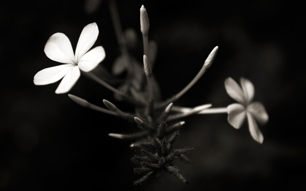
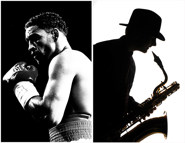
Perhaps one of the most fundamental of these components is shape. Regardless of whether we are photographing people, buildings, landscapes, or any of the other endless possibilities, every subject has shape. Definition. It can be subtle or dramatic, but everything we photograph is defined to a certain extent by its outline. The most graphic representation of shape comes from a back-lit silhouette or underexposure, either of which draws less attention to individual features and more to the overall shape of the subject. While this photo of a boxer is very brightly lit from the side, the high contrast lighting and black background combine to engage the viewer with a strong emphasis on the shape and outline of the subject. In a more classic silhouette, the sax player was lit completely from behind. The soft, wraparound quality of the light does bring out a bit of detail in the instrument, but the visual emphasis rests primarily on the shape and outline of the musician, creating an entirely different overall feel to the image.


001-Shape


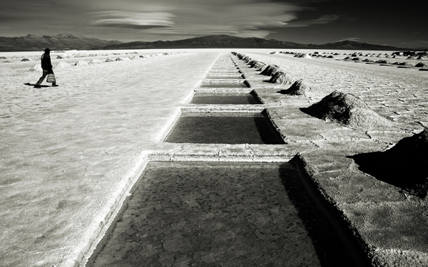
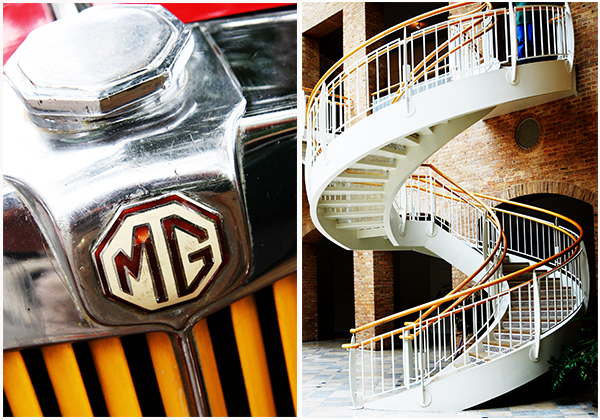
Obviously, high contrast and silhouette are not the only ways to illustrate the shape of a subject. As noted, everything that comes in front of our camera has shape. How and to what extent you choose to highlight it relies on how you choose to place it in your frame. The photograph of the staircase was taken for an ABC project entirely because of its shape, while the radiator grill of the 1938 MG has multiple shapes and lines which draw the viewer's eye into the photo from top to bottom.


002-Shape


COLOR & TONE


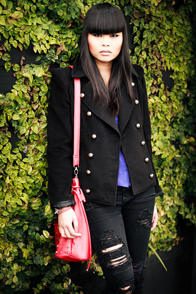
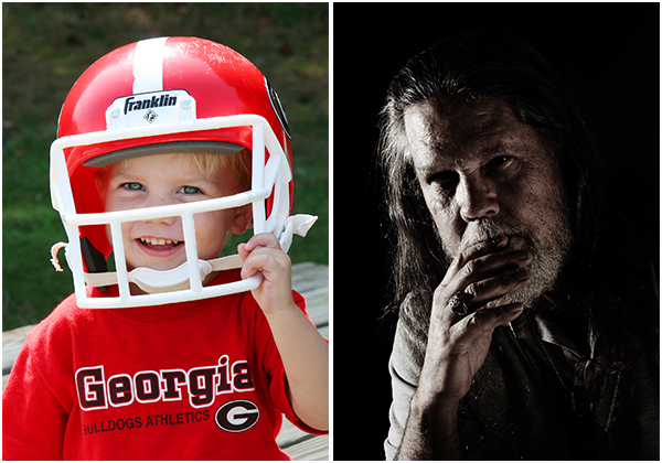
While color often grabs our attention first, sometimes we take the extra steps to actually plan for it. Bright and bold. Soft and muted. Contrasting or Complementing. In the portrait of the boy with the football helmet, the bright red obviously grabs your attention and draws you in. In the low-key portrait on the right, however, it was the darker tones and color palette that caught my interest.


003-Color and Tone


FORM & TEXTURE


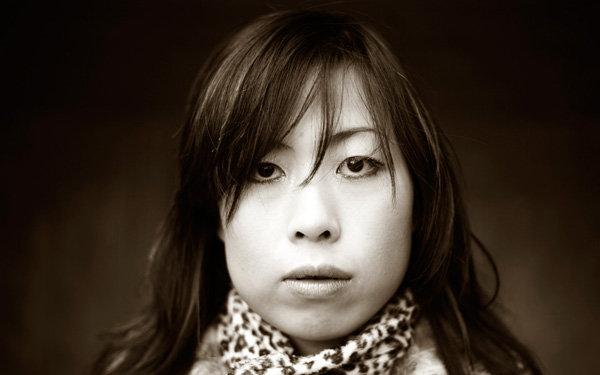
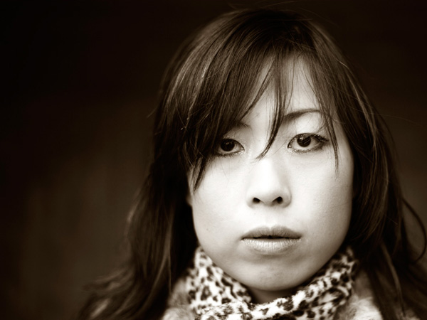
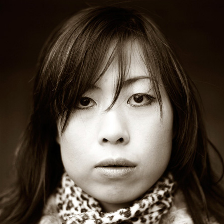
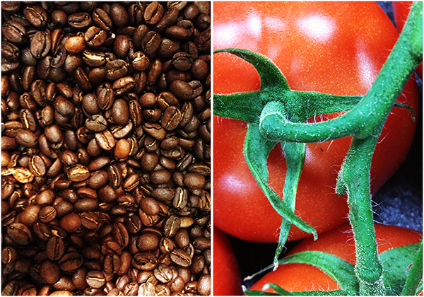
When we start introducing light and shading across a subject we produce various qualities of shape, shifting lines, and intensity of color. While our silhouette primarily emphasizes a subject's two-dimensional shape, it is "form" that best describes the three-dimensional qualities of a subject. Form gives substance, depth, and definition to the silhouette- bringing it out of the shadows and into the foreground. Here is where the combination of light, color, and shadow combine to create texture in our images. In each of the images below, the form and textures are created and accentuated not only by the composition, but also by the way the light falls across the subject.


004-Form and Texture


As is the case with things like the exposure triangle or characteristics of light, the extent to which each of these is emphasized in any given photo is going to rely heavily on the photographer and how they express their personal vision and individual style, as well as the mood they are trying to convey and the story they are trying to tell. In virtually every situation, however, one of these components plays a huge role in making a photographer stop in their tracks and say, "I need to photograph that."


Post originally from: Digital Photography Tips.

Check out our more Photography Tips at Photography Tips for Beginners, Portrait Photography Tips and Wedding Photography Tips.


Anatomy of a Subject


Tuesday, July 1, 2014

Composition, Balance and Visual Mass


Black and white photo


In previous articles I wrote about the concept of balance in relation to the colours orange and blue, and in relation to composition in the square format. Today I think it will be interesting to explore the concept of balance in relation to photographic composition in more depth.


Central composition


Black and white photo


This is a portrait that I created with a central composition. There are a couple of interesting things going on here. One is that the composition is virtually symmetrical. One half of the image is a mirror image of the other, with a few variations. In this case, that reinforces the sense of balance created by the central composition.


What happens if we crop the image to move the girl's face off-centre, closer to a third? Let's take a look. Here I've cropped it to the 4:3 aspect ratio:


Black and white photo


Do you see the difference? In this example the eye is encouraged to move around the frame more by the off-centre composition. Placing the girl's face off-centre has created a more dynamic composition.


The first version is about balance, the second is about being off balance and adding a kind of tension to the image. The subject is the same, but one simple variation in composition creates two different effects.


Tonal contrast


The portrait is also an interesting study in tonal contrast. The light tones of the face and scarf contrast with each other. Roughly one-third of the image is made up of light tones, and the rest dark tones. What we're looking at here is an example of what some photographers refer to as visual mass. Light tones pull the eye more than dark tones. Therefore, to create a balanced image, there needs to be more dark tones than light tones. If the ratio was around equal, the image wouldn't feel so balanced.


This is what happens if we crop the portrait to a square. The ratio of light to dark tones is about even. But the sense of balance between dark and light tones in the original has been lost:


Black and white photo


Here's another example of balancing the visual mass between light and dark tones:


Black and white photo


Now, here's another example to illustrate the same concept:


Black and white photo


The photo is split into three bands. The strips of dark tones at the top and the bottom are balanced by the band of light tone in the middle.


There are other ways this image is balanced too. The mountains occupy the bottom part of the frame, and are balanced by a large expanse of stormy sky. The mountains have more visual mass than the sky, therefore the photo benefits from having more sky in it.


The telegraph pole in the bottom right third is the focal point of the image. It has a lot of visual mass, assisted by its placement on the thirds. The visual mass of the telegraph pole is so strong that even at this small size it is balanced by the rest of the image.


Finally, an image with a composition that at first glance seems to be at odds with what I said earlier about tonal balance:


Black and white photo


In this image, the light tones of the salt flats are balanced by the brooding dark tones of the mountains and sky in the distance.


The thing about visual mass and balance is that they are difficult concepts to condense down into rules like the rule-of-thirds. Every scene is different and the best composition may depend as much upon your intent (ie. would you like a balanced image, or a less balanced one with more dynamic tension?) as it does upon the subject.


One of the best ways to improve the composition of your images is to read as much about these concepts as you can, absorb them, and then compose according to 'feel'. Does the image feel right when you look through the viewfinder? As your understanding of composition improves, so will your photos.


Mastering Photography


Black and white photo


My latest ebook, Mastering Photography: A Beginner's Guide to Using Digital Cameras introduces you to digital photography and helps you make the most out of your digital cameras. It covers concepts such as lighting and composition as well as the camera settings you need to master to take photos like the ones in this article.


Post originally from: Digital Photography Tips.

Check out our more Photography Tips at Photography Tips for Beginners, Portrait Photography Tips and Wedding Photography Tips.


Composition, Balance and Visual Mass


Wednesday, February 5, 2014

Lenses and Seeing


Lenses and Seeing article


The lens is the 'eye' of the camera. The selected focal length and aperture determine the look of the photo. The lens you are using may also have other characteristics that contribute to the look.


These influence your approach to composition. The idea is to work with the visual characteristics of the lens you are using rather than fight against them. Ask yourself how you can get the best out of the lens you are using.


To start, you will need to understand why a telephoto lens is different from a wide-angle, and how depth-of-field is affected by aperture choice and focal length.


Let's look at some examples taken with lenses that I have owned:


Sigma 50-150mm f2.8 lens


Lenses and Seeing article


I created this image by setting the focal length of the lens to 150mm and the aperture to f2.8. I focused on the grass in the foreground to throw the setting sun out of focus. By the way, I didn't look through the viewfinder at the setting sun. That's potentially dangerous. I used Live View to compose the image instead.


This is how the lens and aperture choice affected the photo:


Narrow depth-of-field: The combination of wide aperture, long focal length and close focusing means the depth-of-field is extremely shallow. Anything other than the blade of grass I focused on is out of focus, including the setting sun.


Compression: The long focal length appears to compress perspective, making the sun look bigger and closer to the foreground than it really is.


Narrow field-of-view: The telephoto lens has a narrow field-of-view and captures just part of the subject. This focal length is good for capturing detail, but not for including the entire scene.


Canon 18-55mm f3.5-5.6 kit lens


Lenses and Seeing article


I set the focal length of the lens to 18mm, its widest setting, and the aperture to f11 when I made this image. These are the effects:


Depth-of-field: The small aperture was required because of the bright sun, but it also ensures that the entire scene is in focus. Every detail has been captured by the camera.


Perspective: I was drawn to this scene by the holes cut in the salt, and the lines created as they disappear into the distance towards the mountains. The focal length emphasises the lines and pushes the horizon into the distance, making it seem further away than it really is.


Wide field-of-view: The 18mm focal length has a wide field-of-view, which enabled me to capture the entire scene.


In many ways the focal lengths used to create the photos above are opposites. The telephoto lens brings the subject closer. Only part of the scene is in focus thanks to the wide aperture.


The wide-angle end of the kit lens, on the other hand, captures the entire scene and creates a sense of space by making the horizon seem further away that it really is. A narrow aperture ensures everything is in focus.


Canon 85mm f1.8 lens


Here's a portrait taken with another of my favourite lens, an 85mm prime set to f2.8:


Lenses and Seeing article


Depth-of-field: My model is in focus, and so is part of the background. There is more depth-of-field than there is in the photo taken with the 50-150mm lens set to 150mm. And there is less than in the photo taken with the wide-angle lens.


Perspective: The 85mm lens is a short telephoto lens and it records perspective accordingly. Again, it falls somewhere in-between the 150mm and 18mm focal lengths. Like the telephoto lens the 85mm lens is good for capturing details. You cannot capture as much of the scene as you can with a wide-angle.


Holga lens


Finally, I'd like to show you a photo taken with a Holga lens. You can buy these plastic lenses for digital cameras from Holga Direct. This really is a good example of how the lens determines the look of the photo:


Lenses and Seeing article


Holga lenses have the following characteristics:


Lack of sharpness: A Holga lens is made from plastic and is not intended to give a good quality image.


Vignetting: Photos taken with this lens are characterised by heavy vignetting at the edges.


Conclusion


Hopefully the examples in this article have drawn your attention to how the focal length of the lens you are using and the aperture affect the look of the photo. The lens is the camera's eye, and the characteristics of the focal lens you choose determine the look of the photo. With practise, you will learn to make the best use of your lenses.


Mastering Photography


Lenses and Seeing article


My latest ebook, Mastering Photography: A Beginner's Guide to Using Digital Cameras introduces you to digital photography and helps you make the most out of your digital camera. It covers concepts such as lighting and composition as well as the camera settings you need to master to take creative photos like the ones in this article.


Post originally from: Digital Photography Tips.

Check out our more Photography Tips at Photography Tips for Beginners, Portrait Photography Tips and Wedding Photography Tips.


Lenses and Seeing